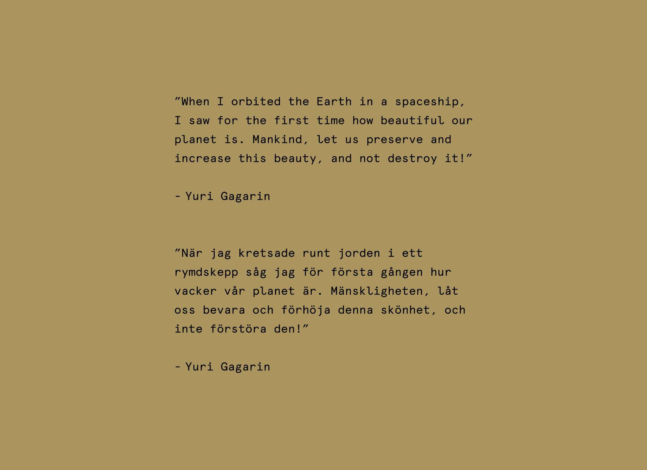
Universeum is a public science centre and museum in Gothenburg, Sweden. In 2019 a new version of Universeums space exhibition for both adults and children was needed. It would focus on humanity's exploration of space and our closest neighbours in the solar system.

For the design and production of the graphic concept for the new exhibition, the humanist and philosophical perspective is reflected in the typography, with an esthetic that is reminding of older school- and story-books. To showcase this esthetic with a very technological and futuristic content arouses curiosity and by creating this contrast it enhances the expression. These cardiac urges of humans to explore space is present throughout all our history.


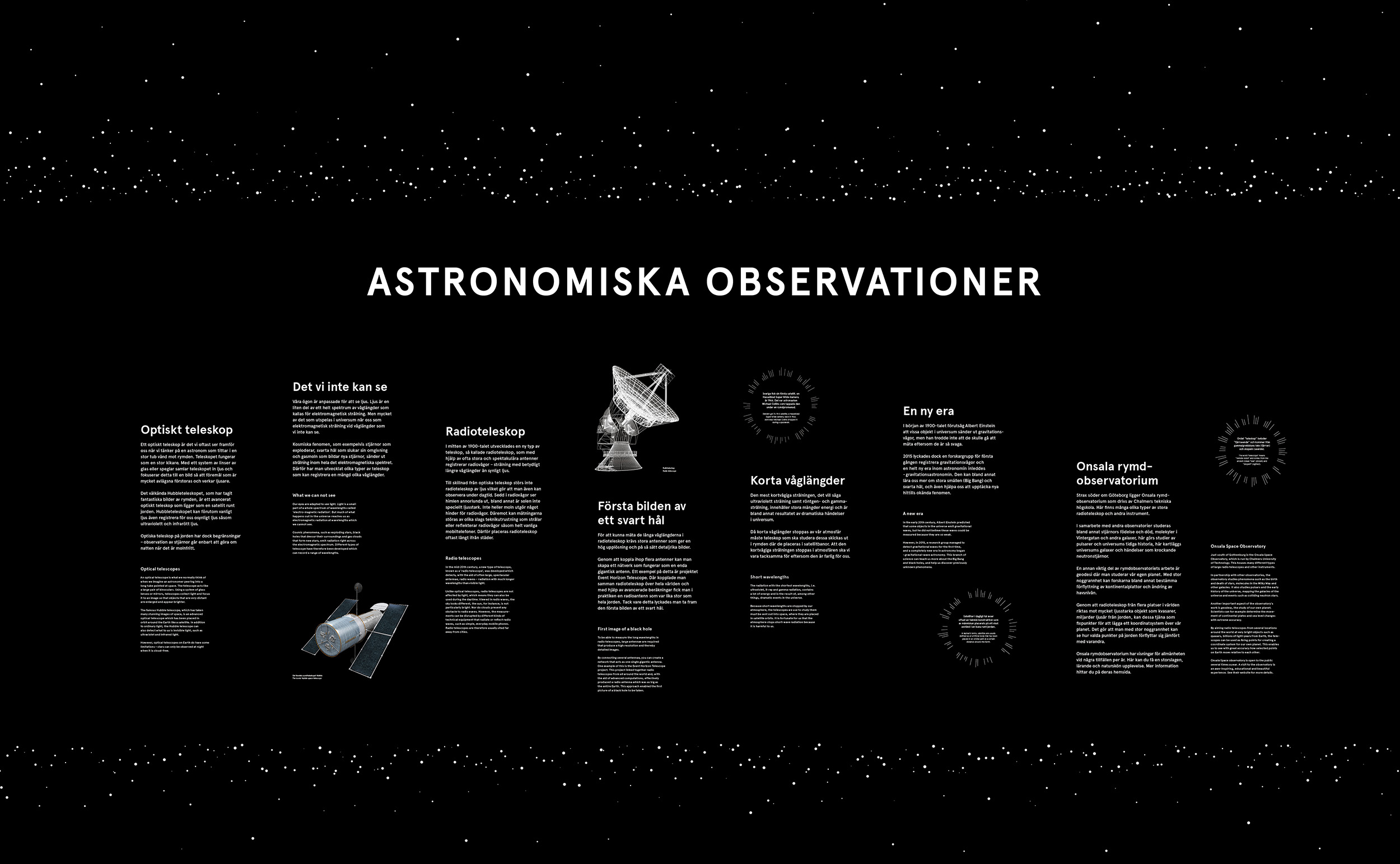
The outer layers of the exhibition is designed around the black background with stars framing the content. We wanted the information to be seamlessly integrated with the spatial experience, enveloping the entire room.
The inner core of the exhibition is covered in gold, inspired by the gold discs on the voyager spacecraft and the metallic exteriors of satellites.
The inner core of the exhibition is covered in gold, inspired by the gold discs on the voyager spacecraft and the metallic exteriors of satellites.

The inner core of the exhibition is covered in gold, inspired by the gold discs on the voyager spacecraft and the metallic exteriors![]() of satellites
of satellites
 of satellites
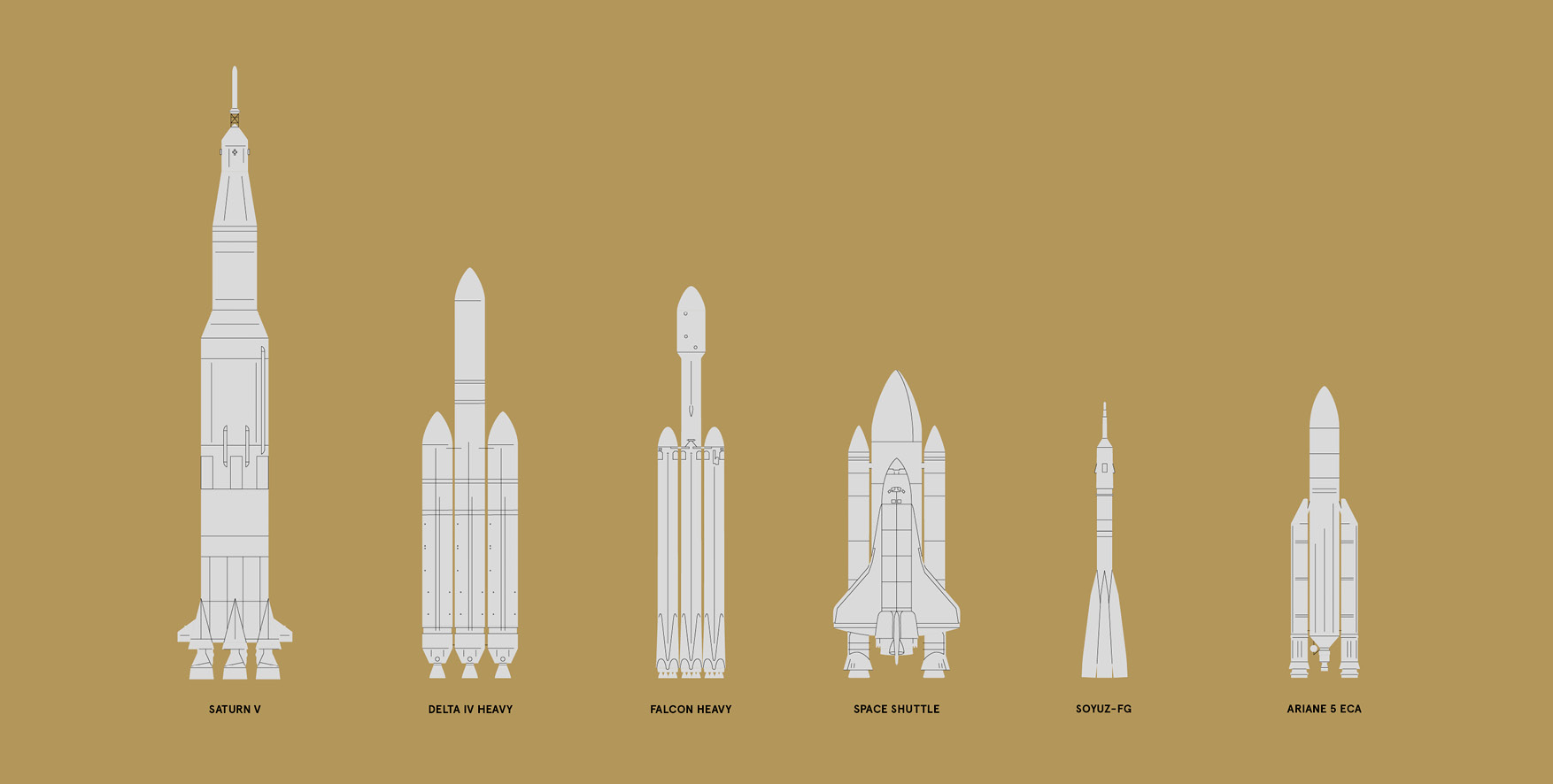


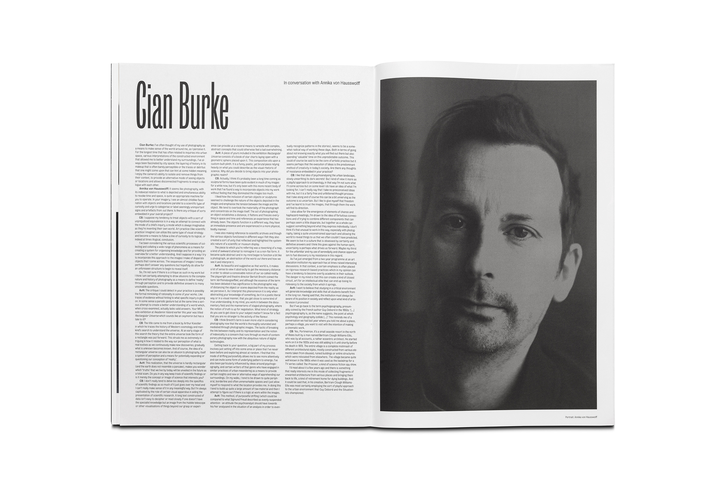
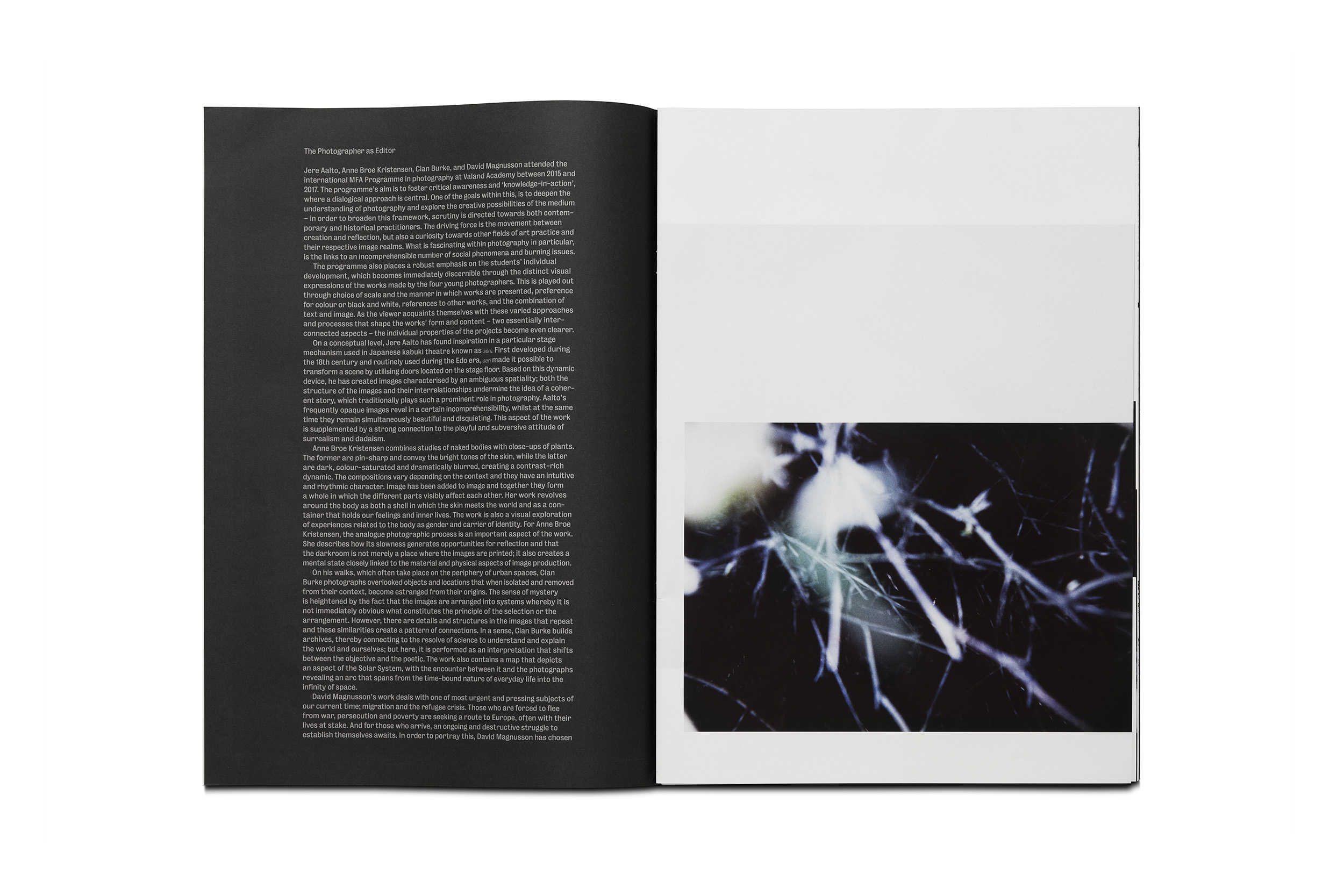
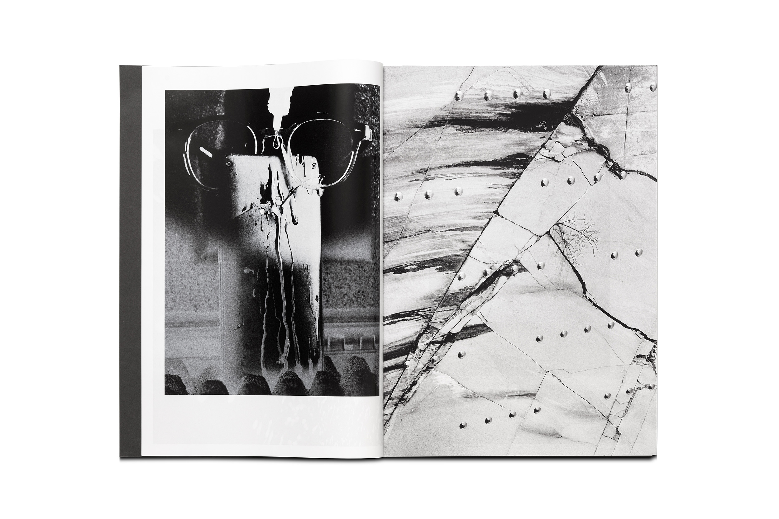
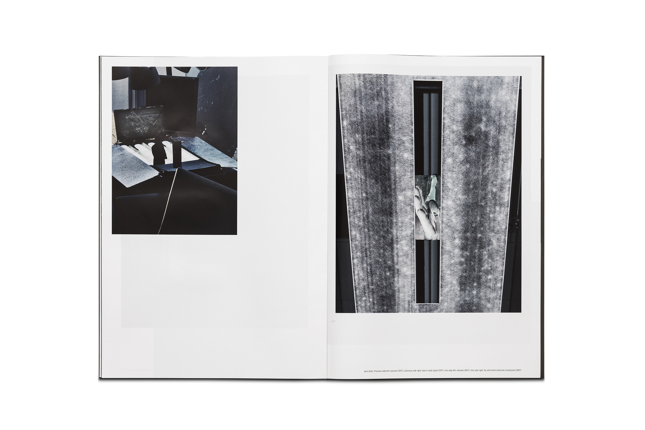
The publication Young Photography Now – Sweden, presents work by Jere Aalto, Anne Broe Kristensen, Cian Burke and David Magnusson, all four from the Master’s programme of photography 2016 at Valand Academy. Photographic artist and educator Annika von Hausswolff is also represented in the publication by portraits of each artist and in an extended conversation about their art.
Published by Art and Theory Publishing
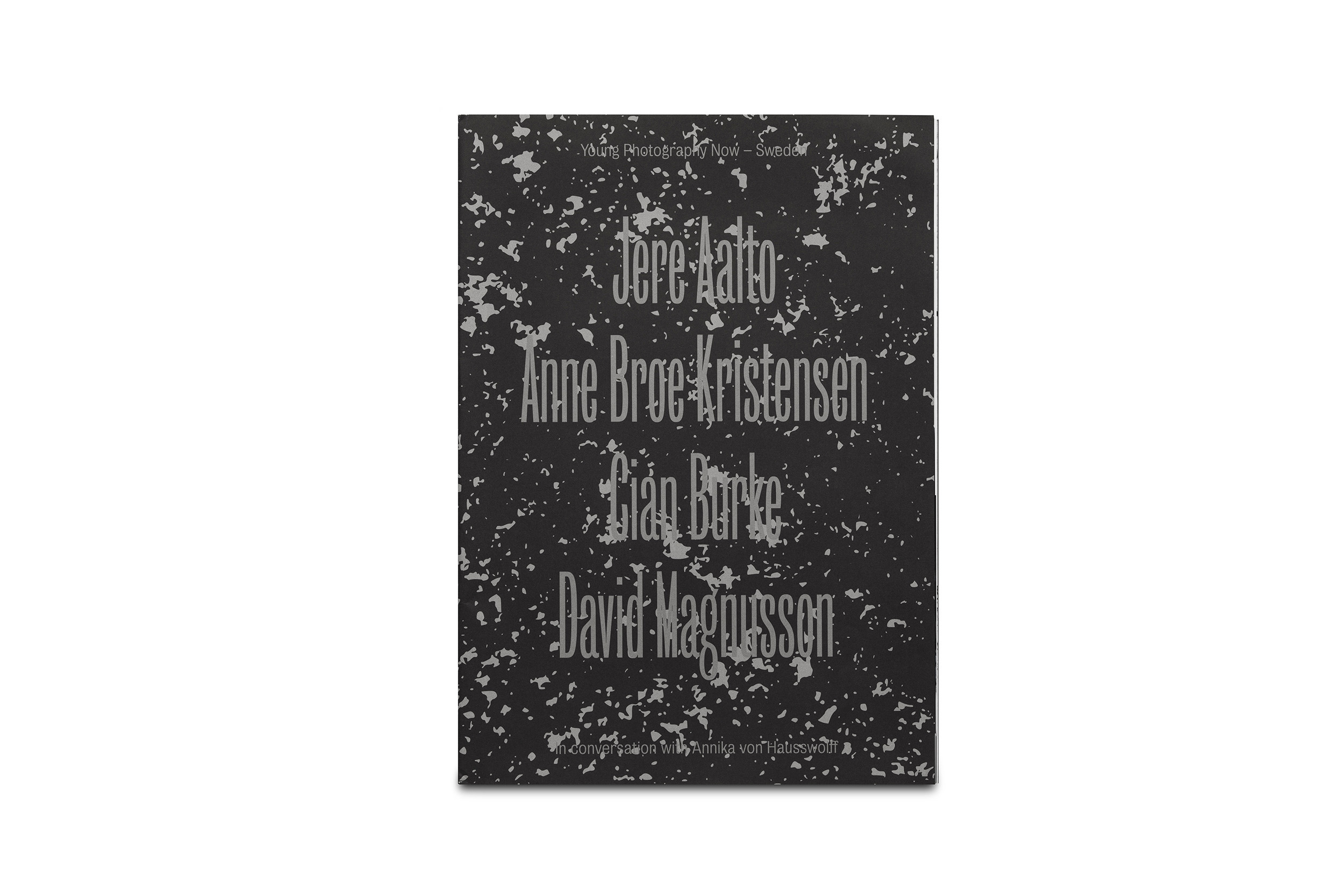
The young, contemporary content is reflected in the bold typography, format and layout. The imagery has room to spread out in this large-sized publication and the sheets with illustrations of their work are loosely included and can be removed and displayed separately.


Svenska fotografers förbund (SFF) is a non profit organization for professional photographers in Sweden. SFF was founded 1895 and is the largest organisation for professional photographers in Scandinavia.
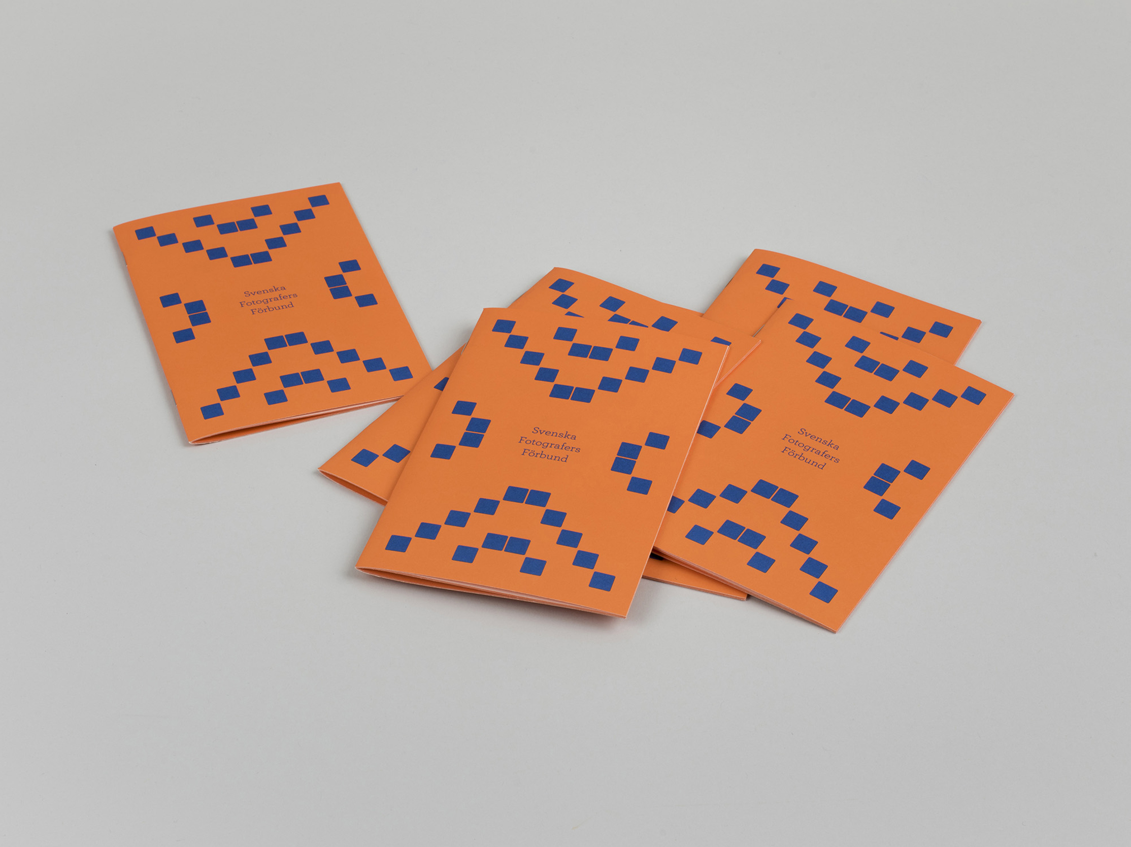
We designed a colorful brochure and animation-ads for both old and potential new members. SFF asked for a more youthful approach that we based on their existing logotype.
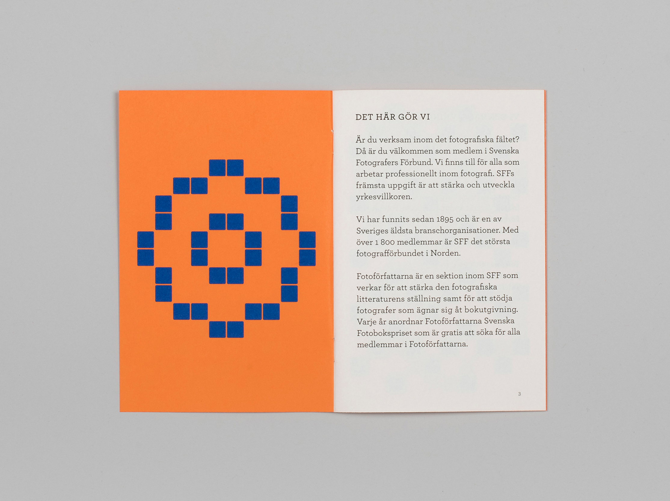

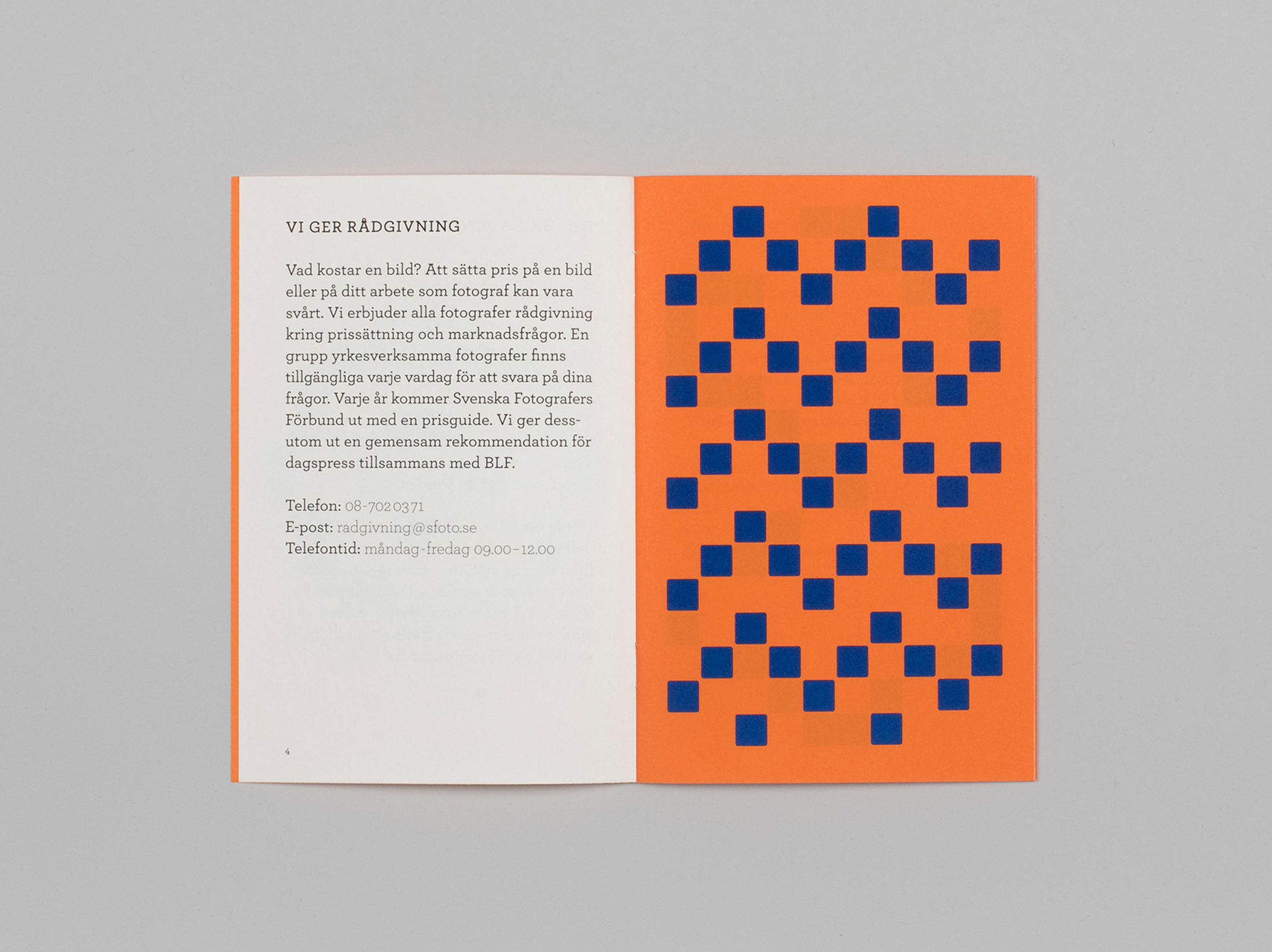


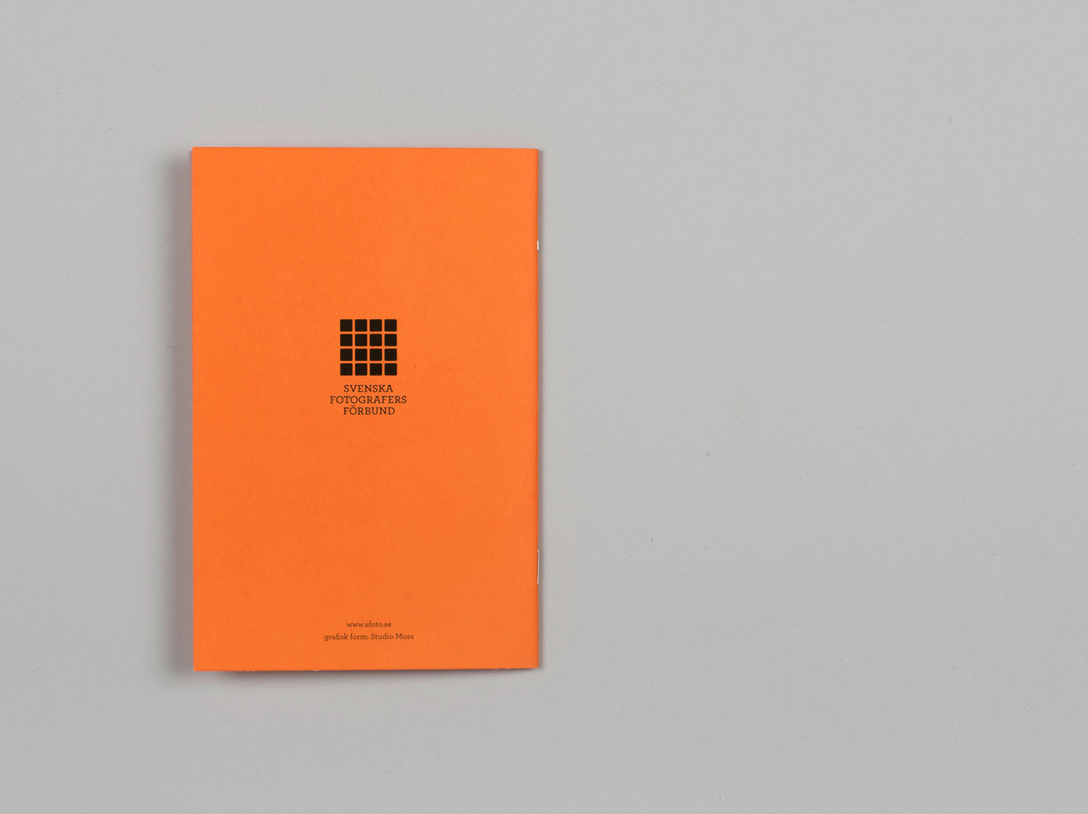
Photo: Simon Rydén
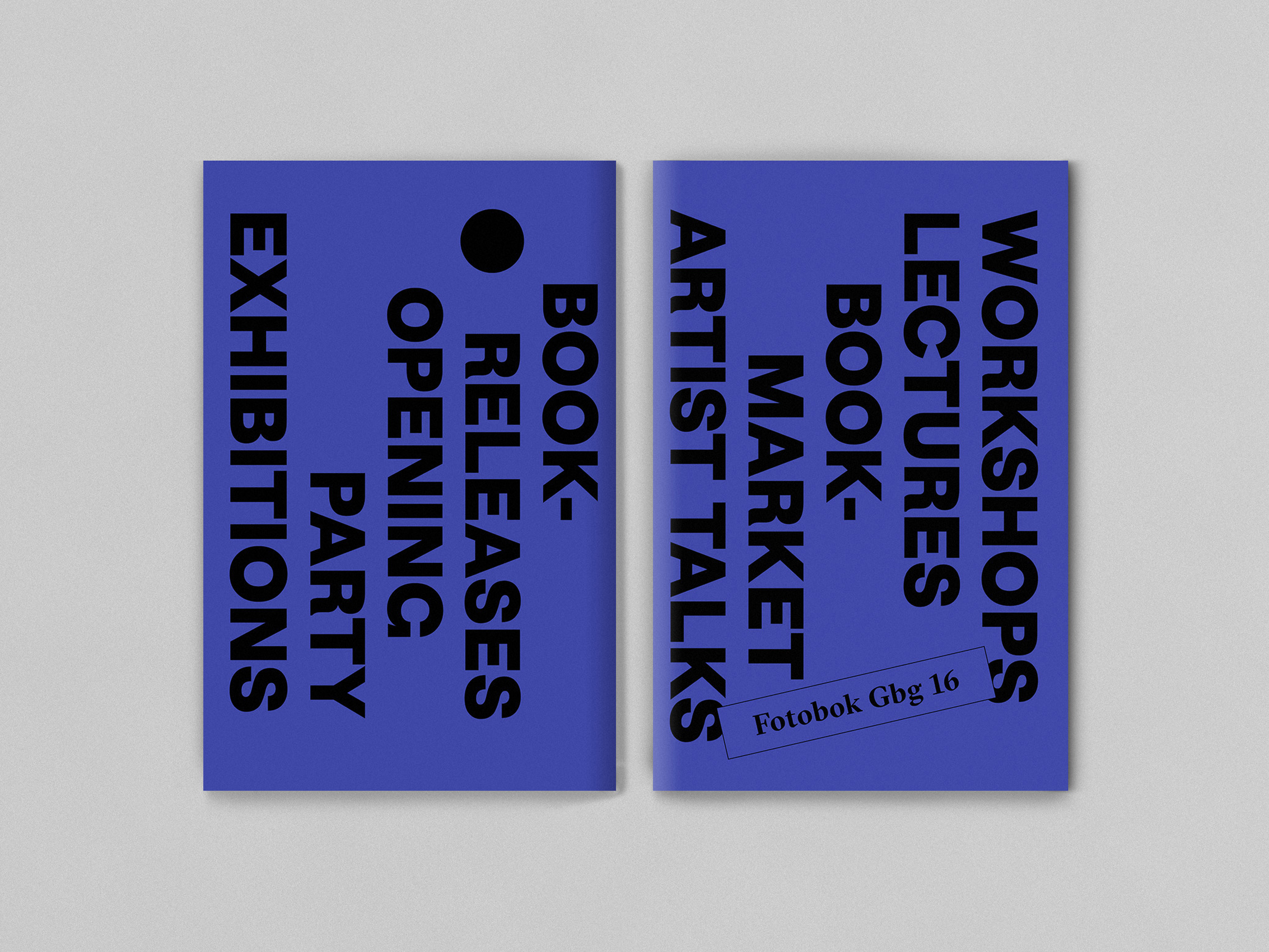
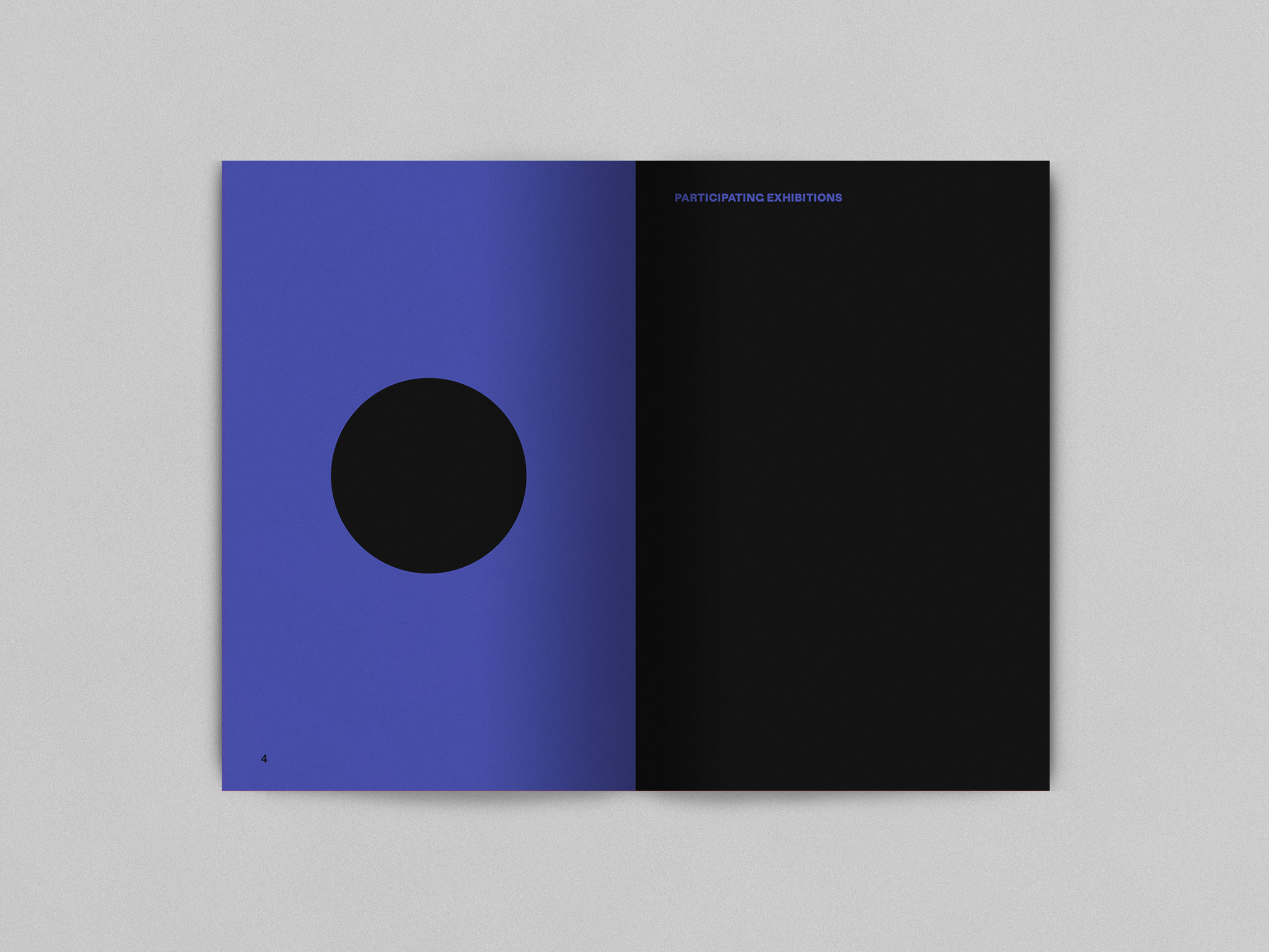
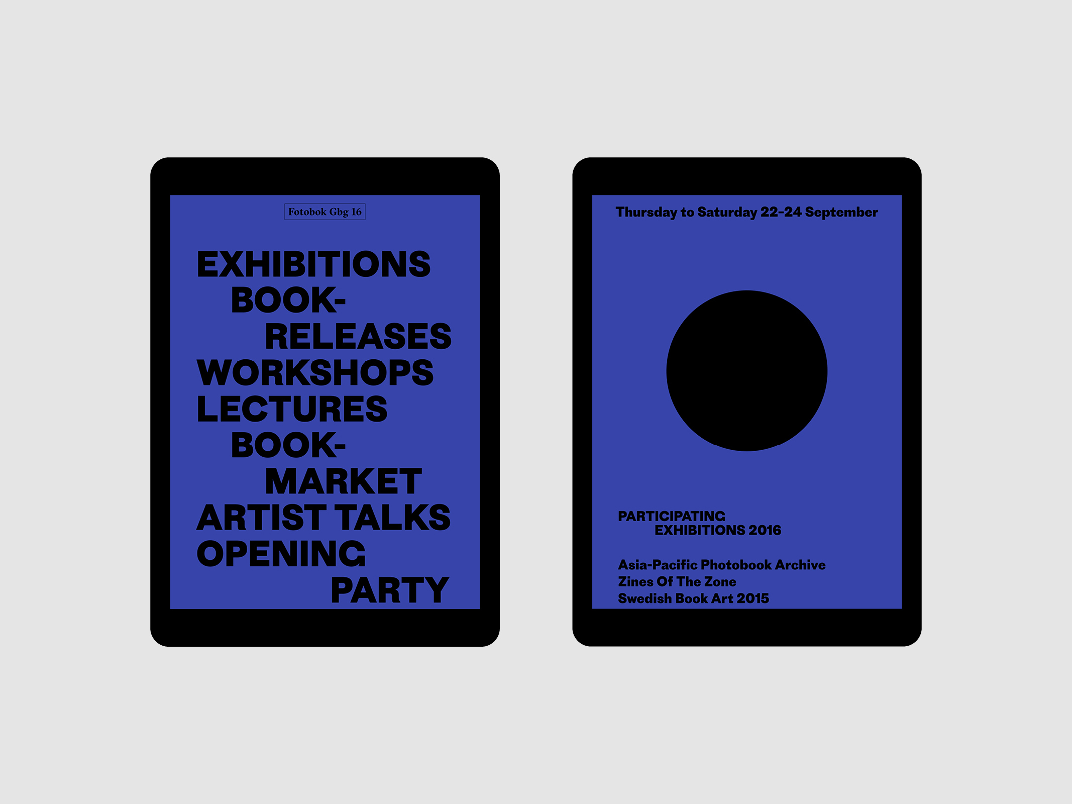
Fotobok Gbg is a yearly Photo Book Festival in Gothenburg. The extensive programme consists of international photo book exhibitions, lectures and artist talks, as well as a book market that host a broad range of unique self published books from all over the world.
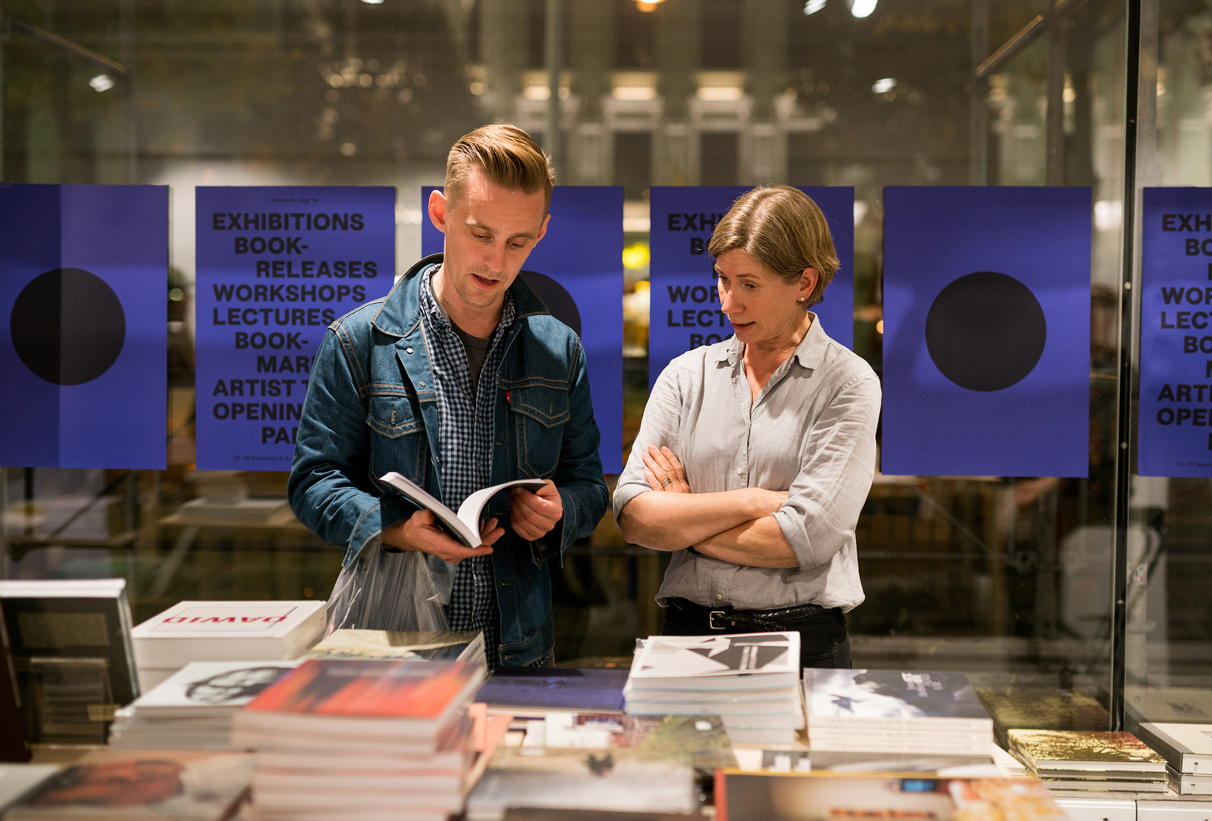
Photo: Hendrik Zeitler

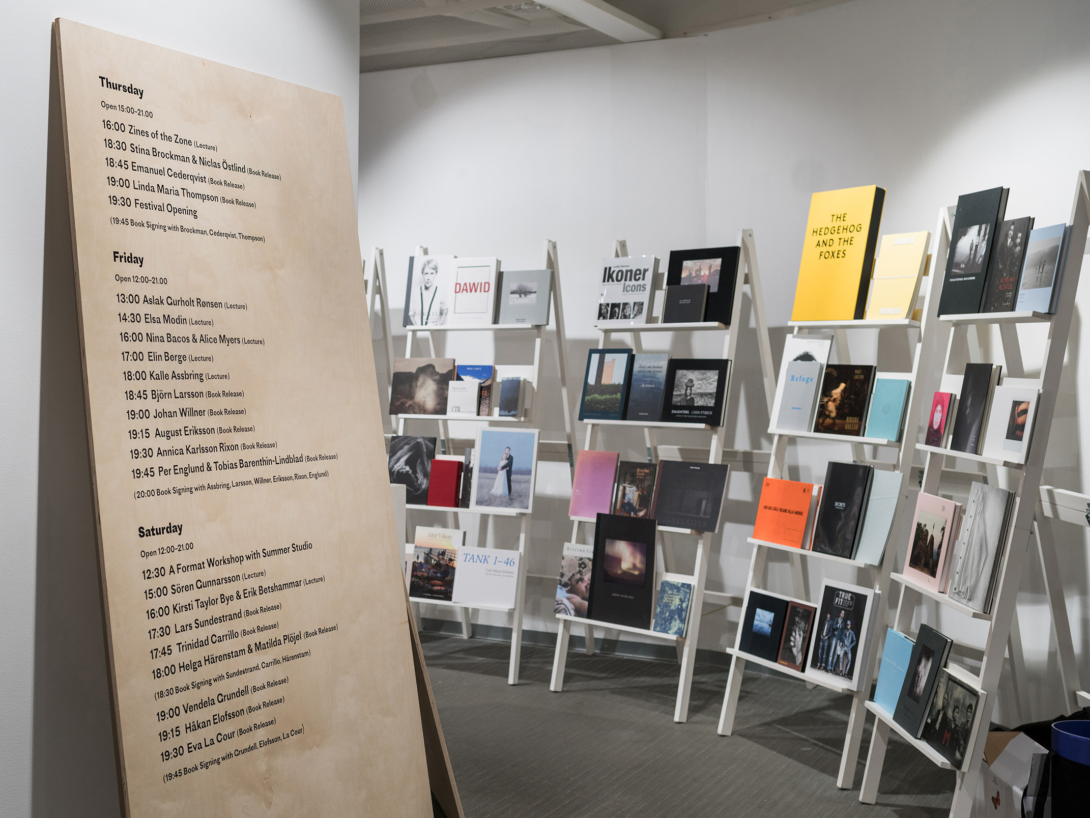
For the visual identity of the festival the black circle is a dominant part and works as an abstract reference to the photo-lens. It creates a distinct visual expression and attracts attention. The design is deliberately free from photographic content, not giving a specific artist more attention than the other. The circle is recurring every year for the design of the festival but comes in slightly different shapes. Together with a vivid color and bold typography it is the constant that ties the annual variations together.


Winner
Swedish Book Art Award
2019
![]()
Swedish Book Art Award
2019
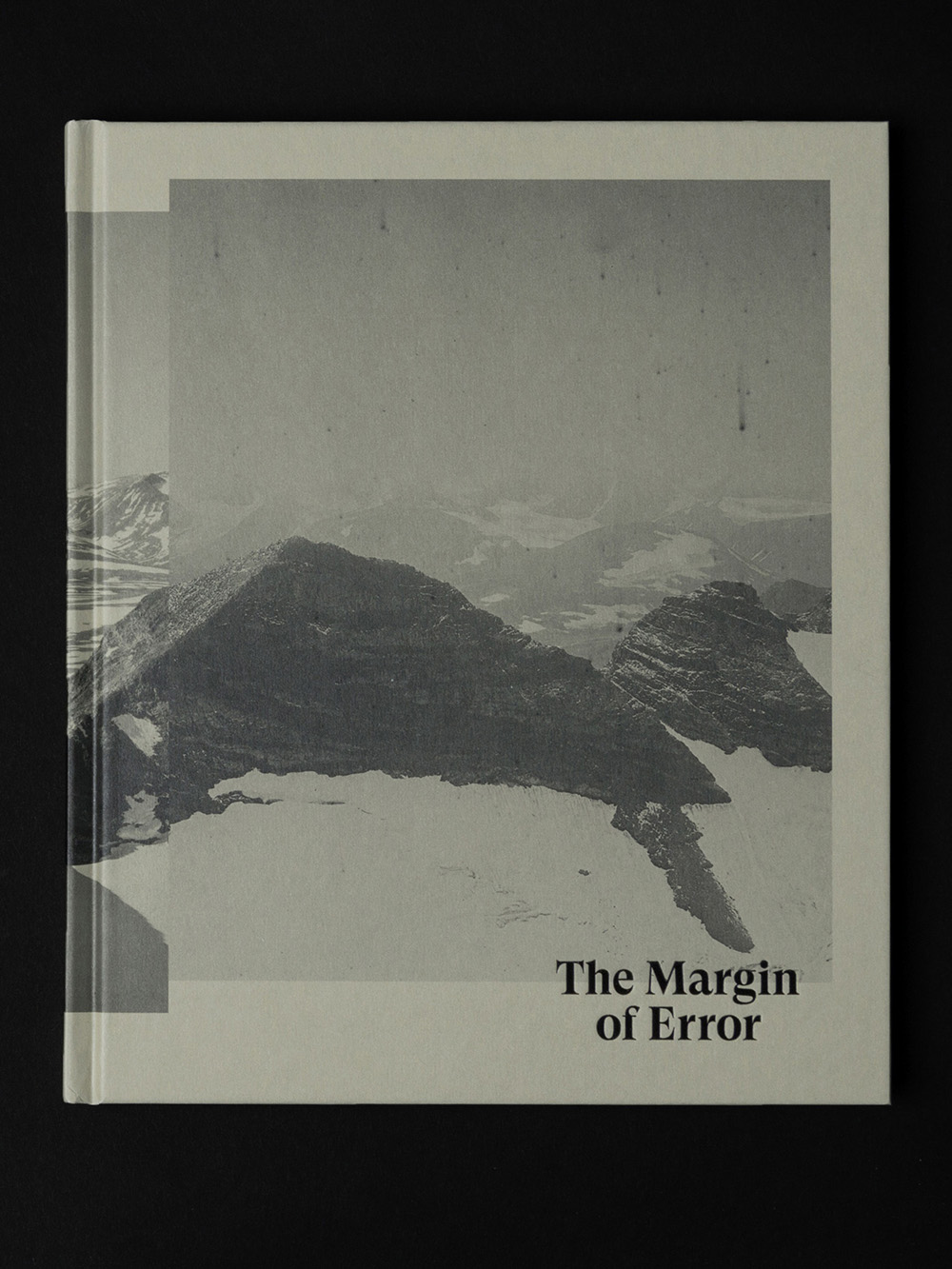
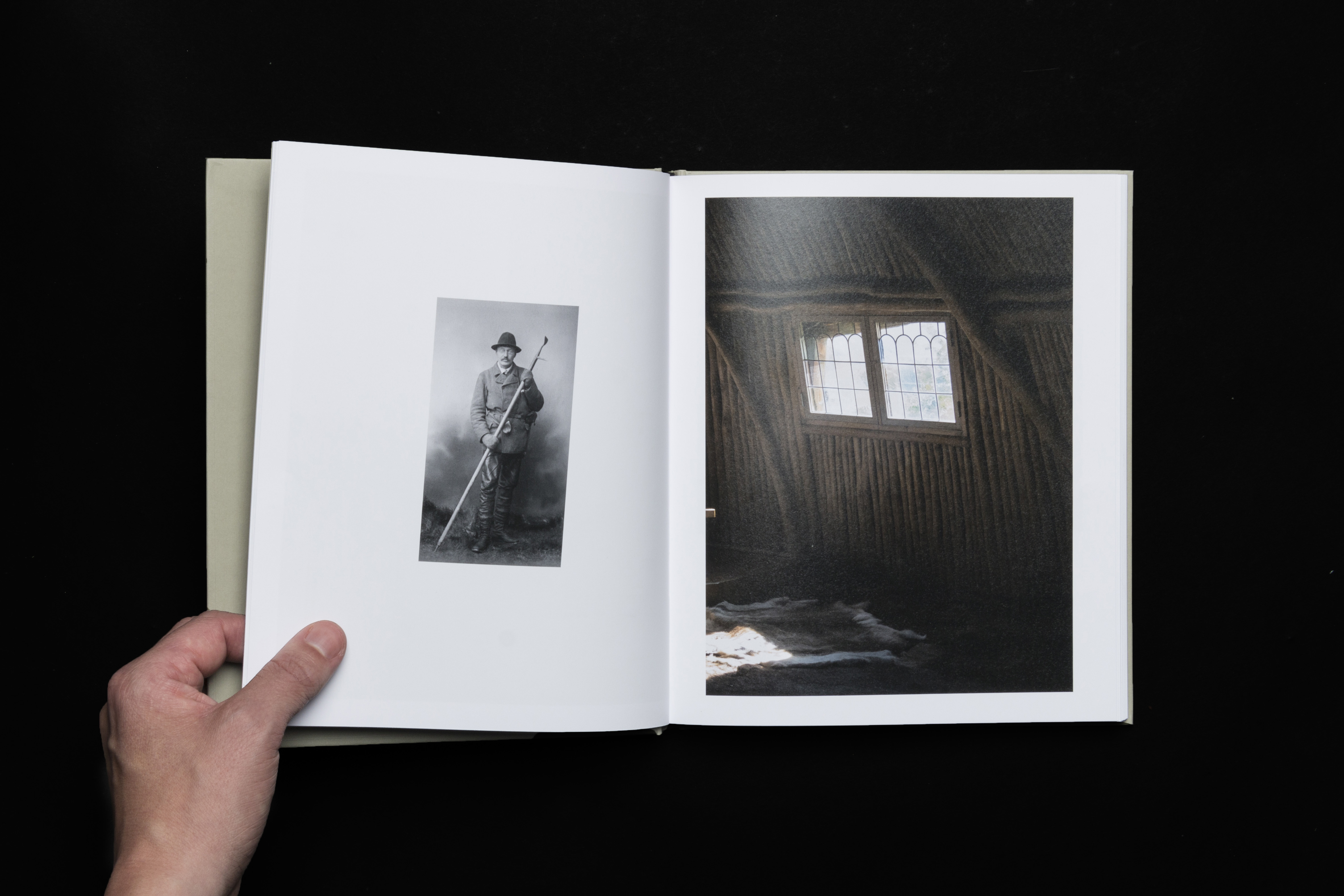
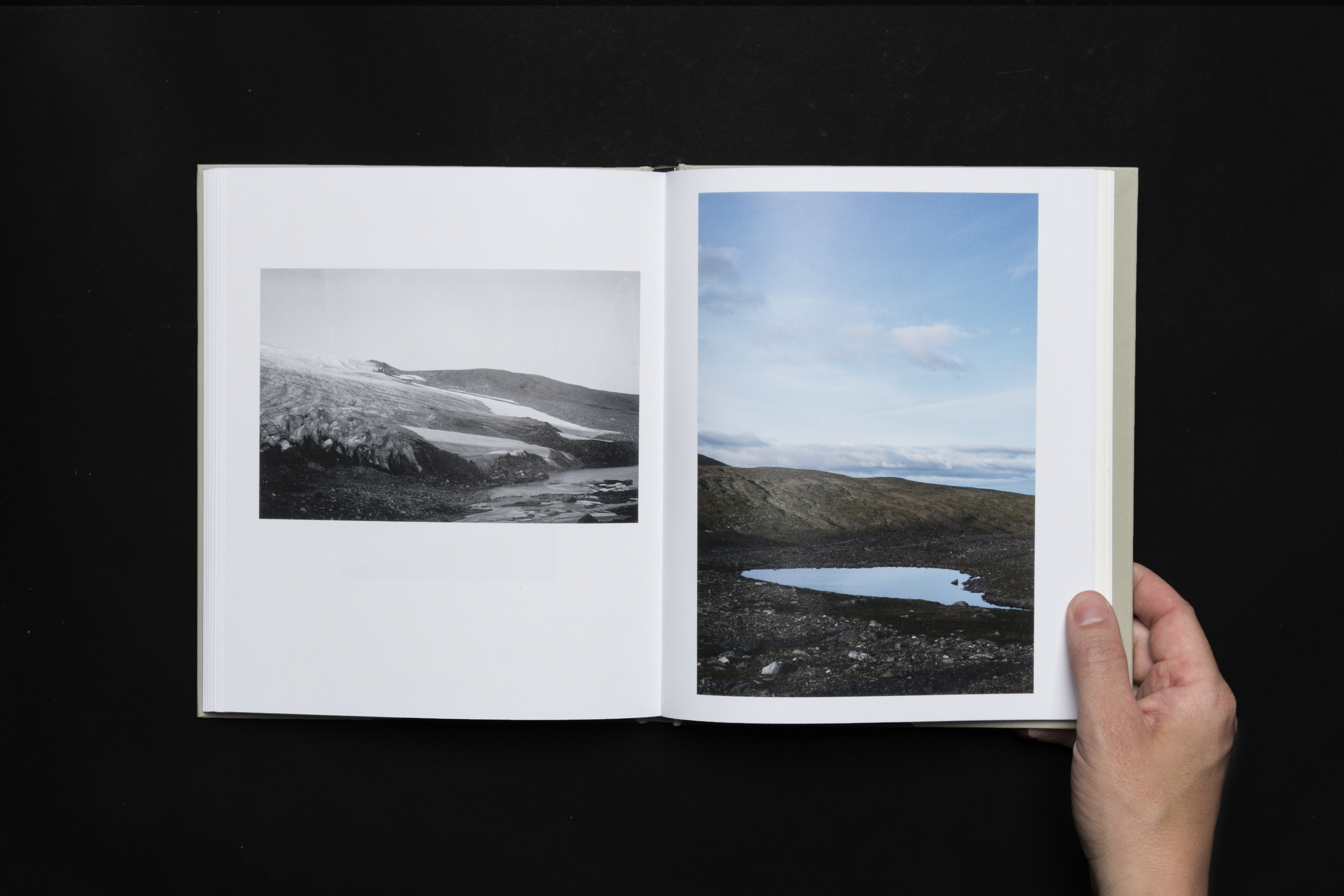
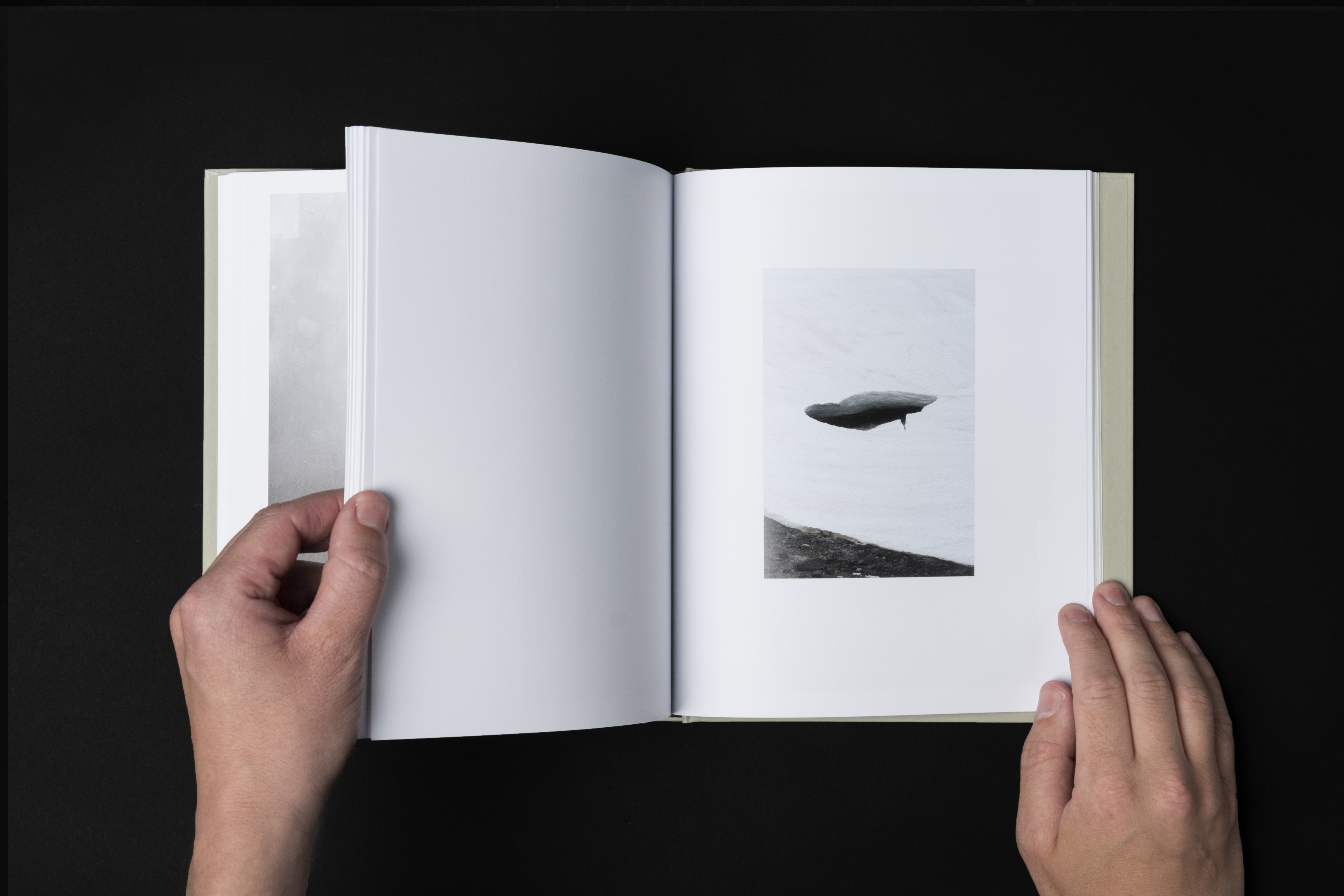
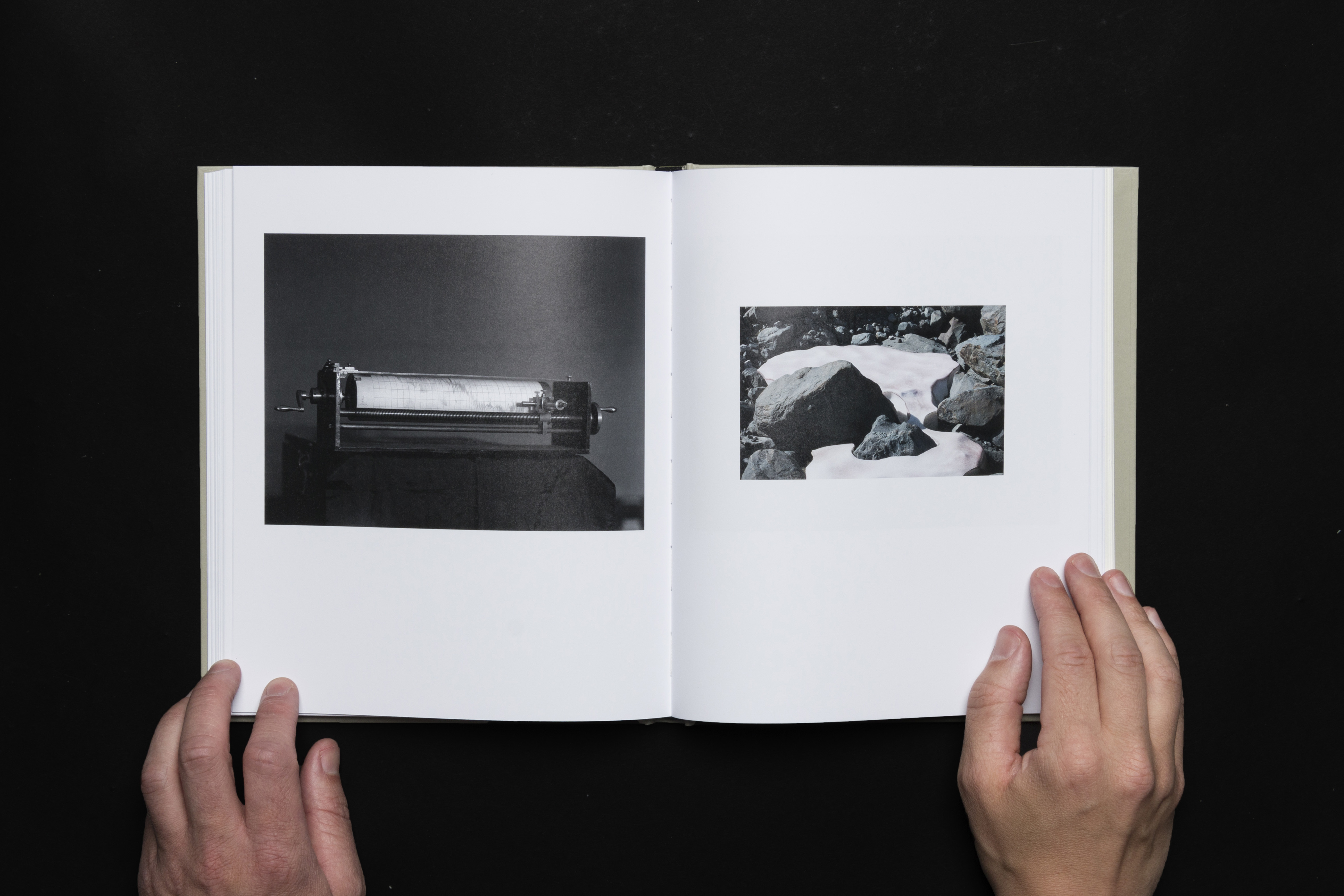
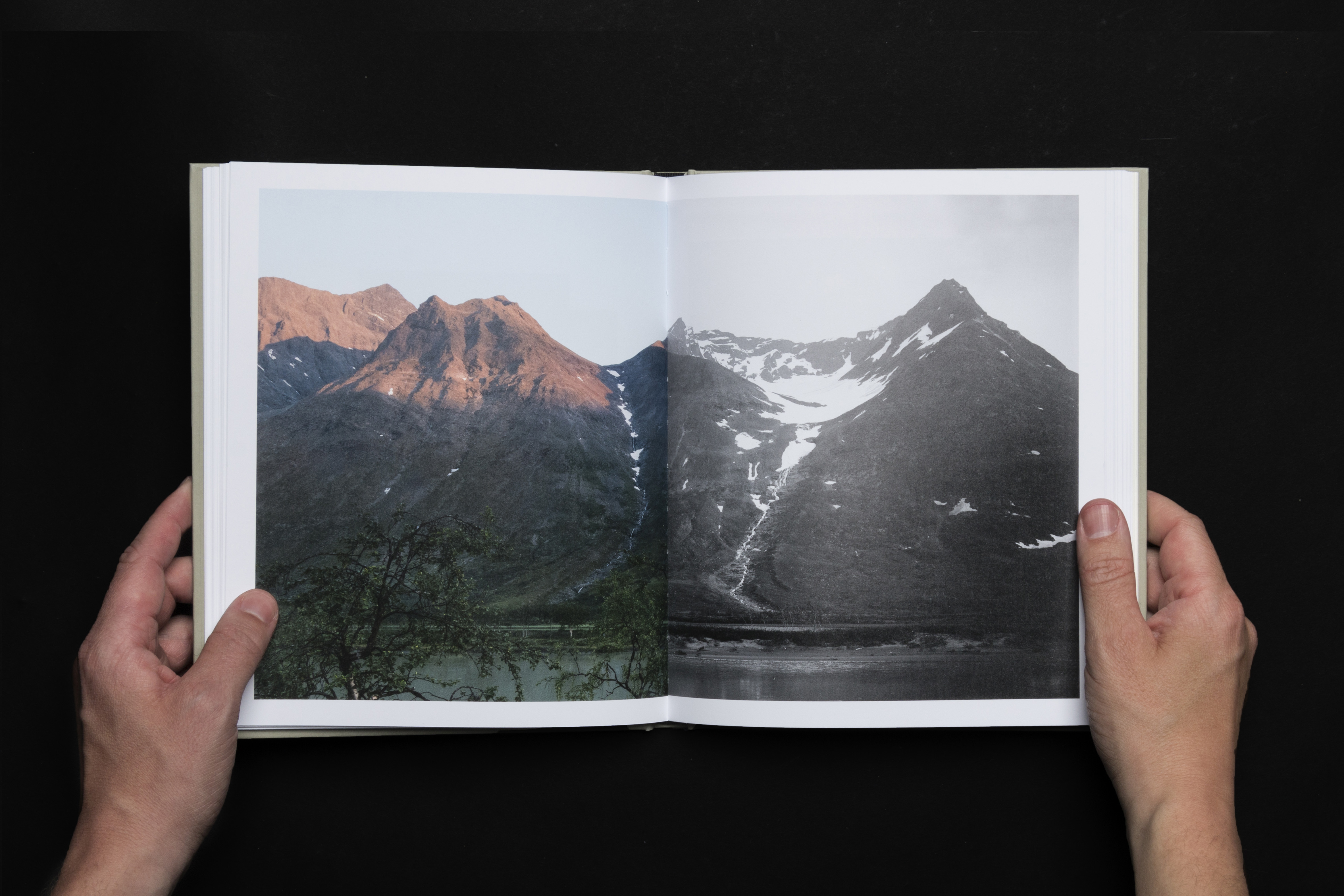
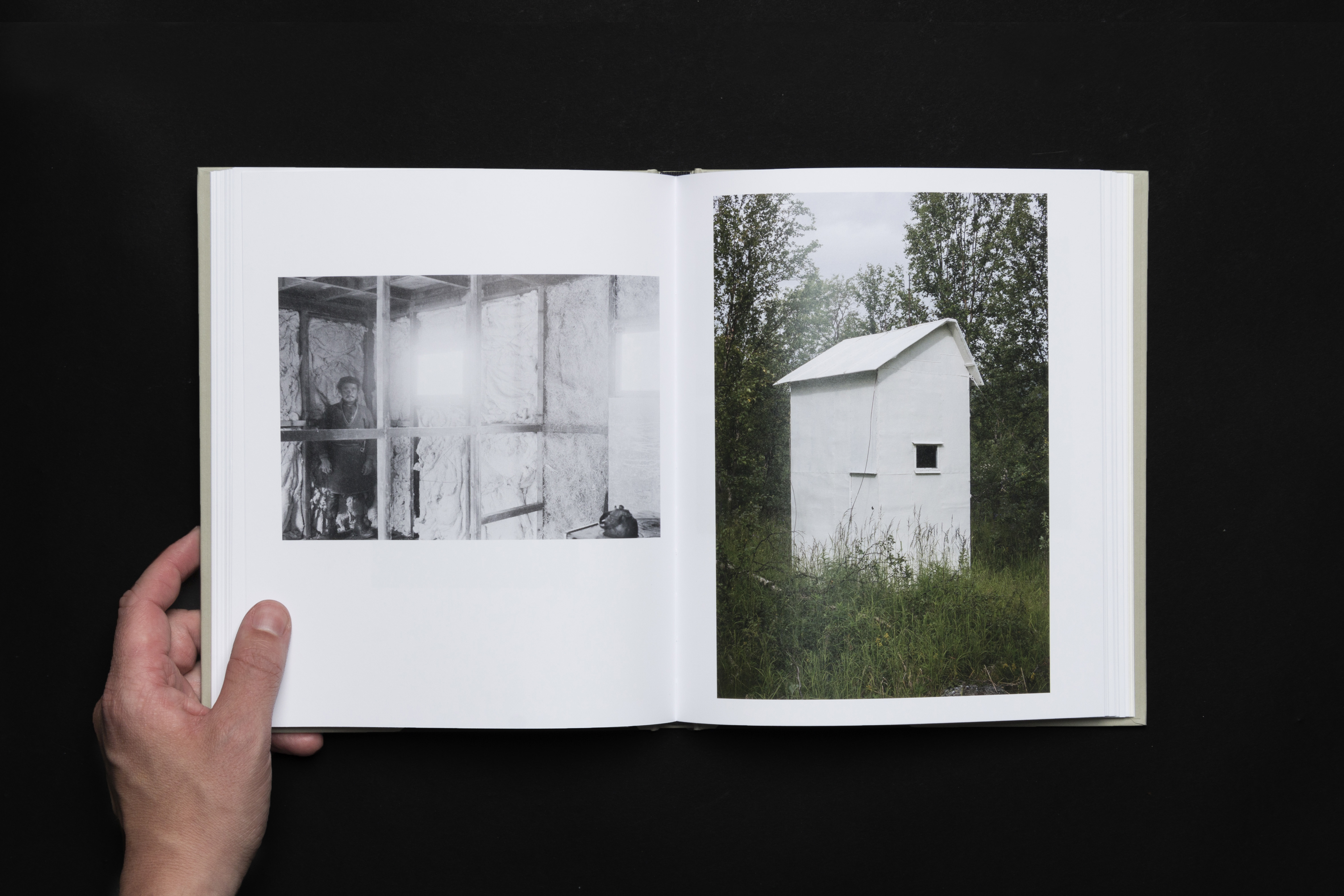
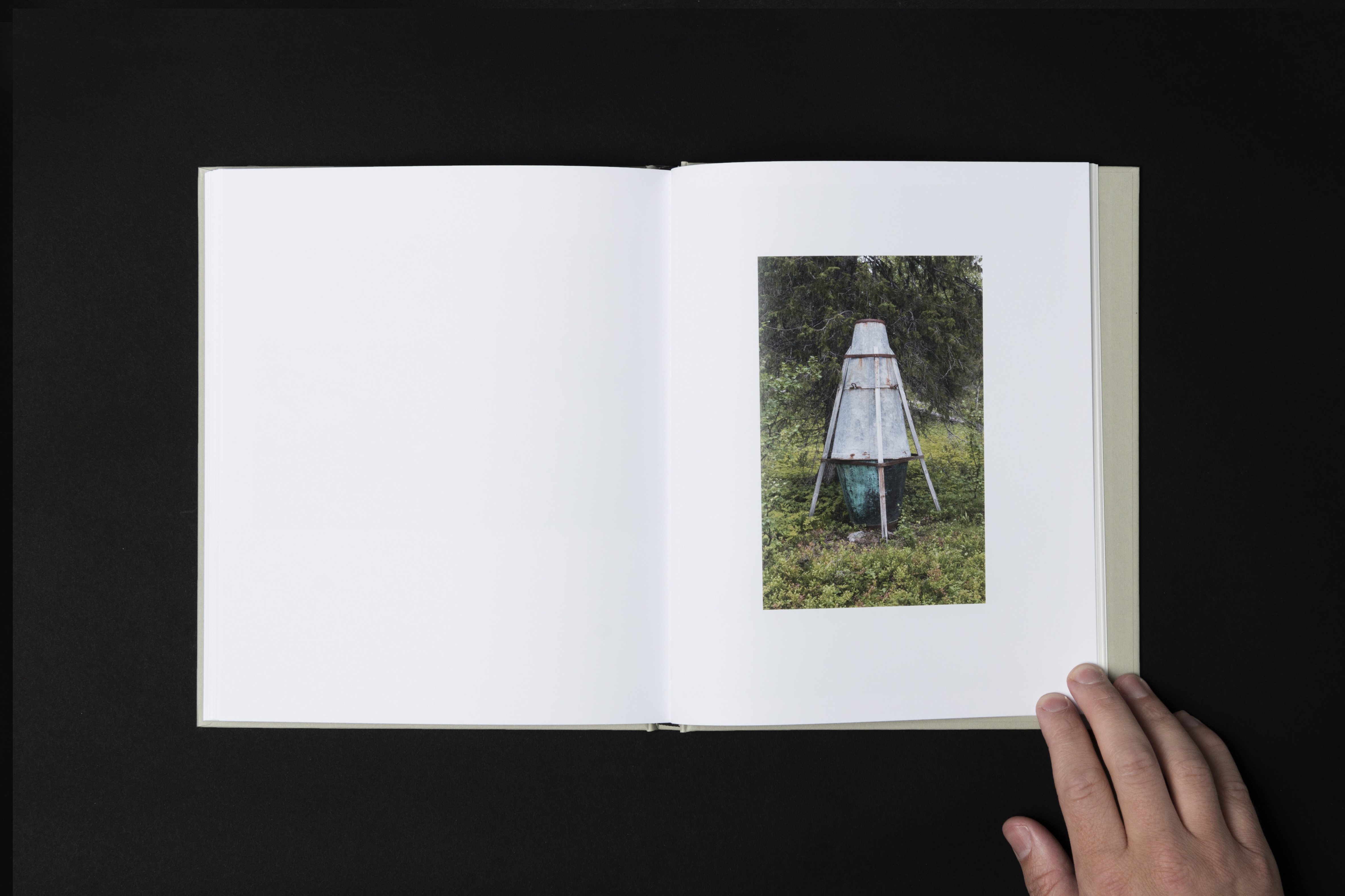
The Margin of Error, by photographic artist Emanuel Cederqvist, continues the work started by Axel Hamberg one hundred years ago, depicting Sarek's National Park in the north of Sweden. In the book Cerderqvist places Hamberg’s archive photos next to his own taken in the same area.
As a landscape, Sarek hasn’t changed considerably since the last ice age around 10,000 years ago. The difference between the photographs is almost indistinguishable. It’s only the camera and the position in the landscape that set the pictures apart.
Published in 2019 by Blackbook publication.
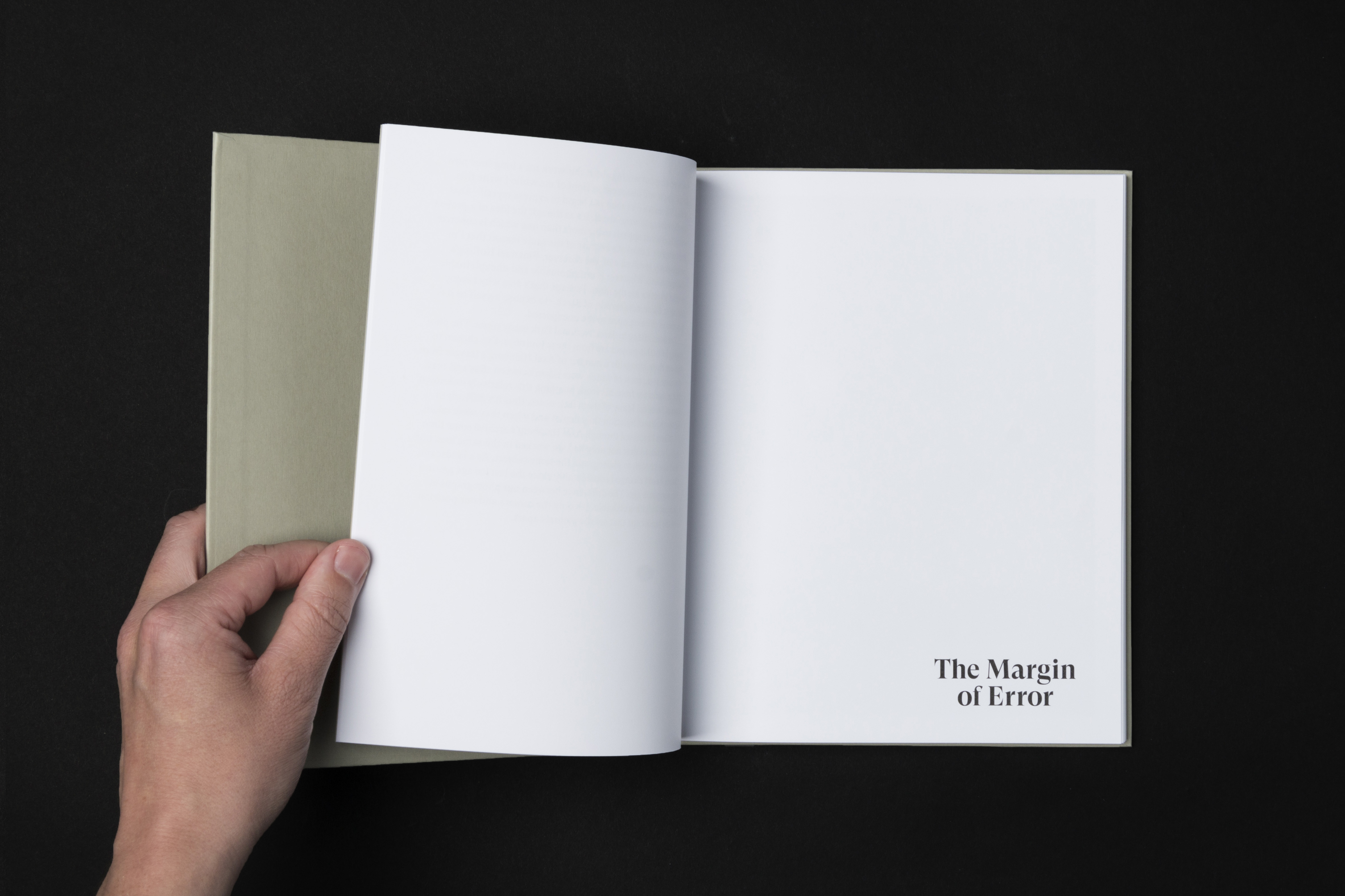
The book is designed with both the past and the present in mind, making it look at home both in a modern bookshelf as well as in a century old archive.
Two images, taken in the same place, one hundred years apart, meet each other on the cover.
Two images, taken in the same place, one hundred years apart, meet each other on the cover.
The design plays with the conventions of traditional hardcovers using familiar elements in unconventional ways.
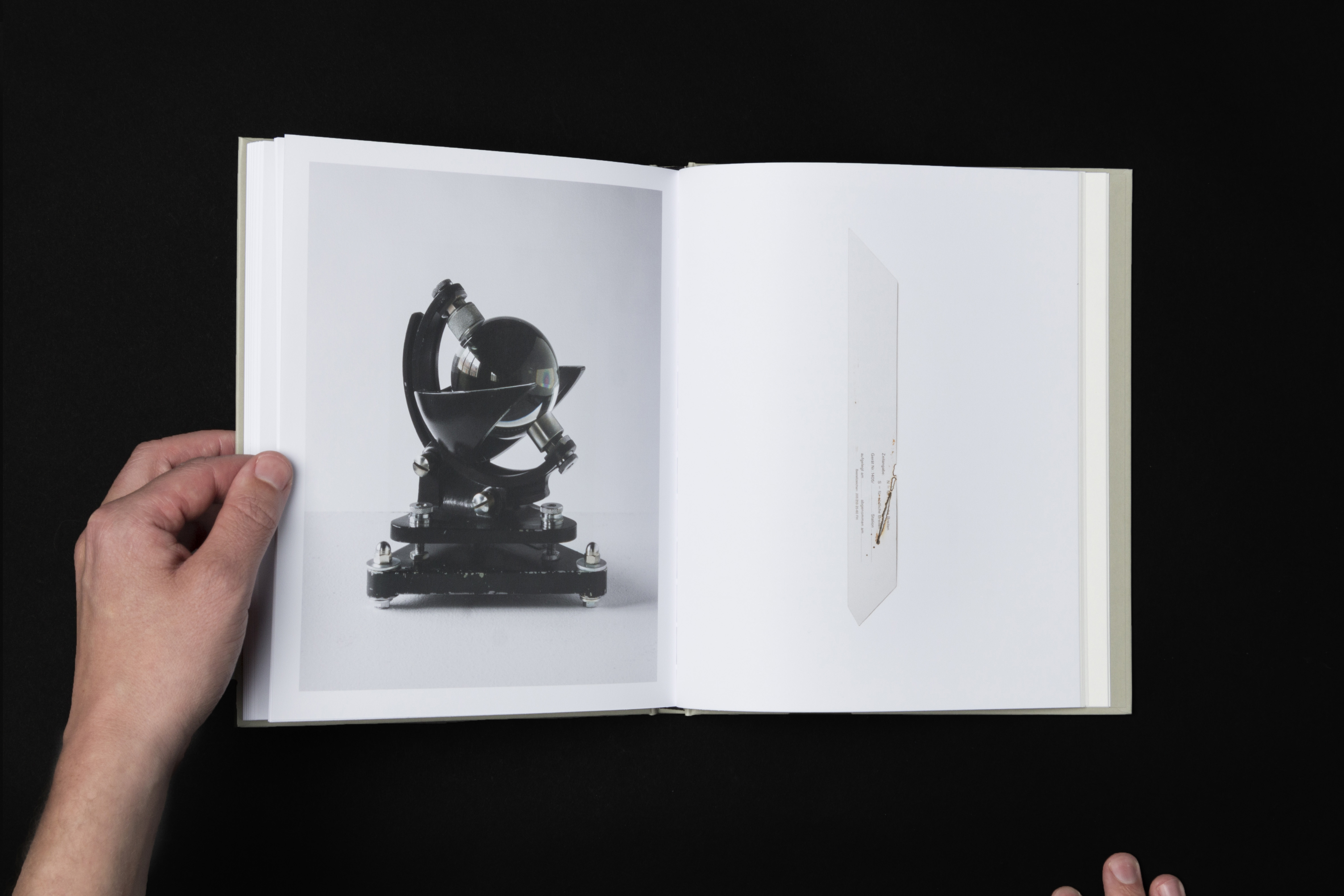
At the end of the book, text and images flow together in a continuous story creating a unique visual index.